Imagine a guy owned a clothing shop. His website looked great. It worked perfectly on laptops.
Then, his sales dropped fast. He had no idea why. A friend told him the truth. She tried shopping on her phone. The buy buttons were tiny. The pictures looked completely broken. The checkout page crashed. He lost a lot of money.
It happens to businesses every day. That’s where modern web app development comes in. Most people shop on phones now. Even Google ranks your site this way. They check the mobile version first. If your website ignores phone users, you lose customers instantly. People will not wait for your website to load. They will just. Go to another website.
Why Responsive Design Is Important
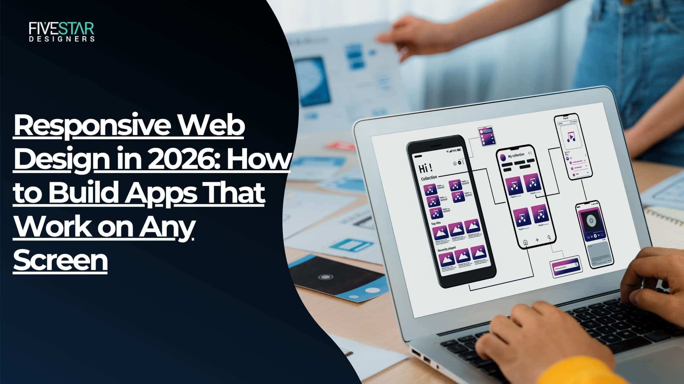
Responsive design is the foundation of a website. A responsive website works on any screen size. It works on phones, it works on tablets, and it works on laptops. It works on big monitors. The layout of a website changes so that it looks good on any screen. The content is always clear. The user never gets lost on a website.
Mobile Traffic Is Important
In 2026, we find that people want to use websites from their phones. If a website takes a long time to load on a phone, it will naturally lose users. A broken website is worse than no website at all. It tells the user that you do not care about the clothing store website users.
Google’s Mobile-First Indexing
Google looks at the version of your clothing store website first. This means you need to make sure your website works well on phones. If your mobile design is weak, your ranking suffers. Good web app development means thinking mobile before anything else.
Mobile-first design also loads faster. According to a 2026 benchmark by Google’s Web Vitals team, mobile-first pages load up to 35% faster than desktop-first designs scaled down.
Mobile-First Web Development: Start Small Scale Up
Most developers design for the desktop first. Then they make it work on mobile. This is backward. You should design for mobile first. Then you add features for bigger screens. It makes you focus on what’s important.
What Mobile-First Really Means
Mobile-first web development means you design the smallest screen first. You build the core experience. Then you add more features for bigger screens.
This forces you to focus. What does the user actually need? What’s essential? The extras come later, on larger screens.
CSS Grid and Flexbox in 2026
Two tools make responsive layouts much easier:
- CSS Grid: It manages two-dimensional layouts. It includes both rows and columns.
- Flexbox: Open for single-dimensional layouts. Almost all modern browsers support Grid.
Both tools are completely free. They pack a serious punch. Use Grid for full-page layouts. Use Flexbox for components inside those layouts.
Relative Units vs Fixed Pixels
Fixed pixels don’t scale. A 200px button fits a laptop. On phones, it breaks the screen. It stays too wide to fit. The button spills off the edge. It makes your site look broken.
Use relative units instead:
- Rem: Scales with the root font size. Great for text.
- %: Fills a percentage of its container. Great for widths.
- vw / vh: Scales with viewport width or height. Great for hero sections.
Websites using rem units saw a 12% improvement in cross-device readability in 2026 benchmarks.
Bootstrap vs Tailwind CSS: Which One Should You Use?
When it comes to Bootstrap vs Tailwind CSS, both are popular. Both help with design. They work differently. Bootstrap gives you built components. Tailwind CSS is more flexible. You can build what you want.
What Bootstrap Does Best
Bootstrap offers ready-made parts. You get buttons and navbars instantly. Modals and cards are included too. Just drop them right in. The 12-column grid system helps. It fixes responsive layouts automatically.
Bootstrap is great when:
- You need to build fast.
- Your team is small or junior.
- Your design does not need uniqueness.
Big platforms use Bootstrap every day. Think of LinkedIn and Twitter. Airbnb relies on it too. It still runs on 75,000+ websites in 2026.
Where Tailwind CSS Wins
Tailwind relies entirely on utility classes. You get no pre-built parts. Instead, you mix small pieces. You build exactly what you want.
Tailwind pages often outperform Bootstrap in First Contentful Paint (FCP) and Time to Interactive (TTI). Why? Tailwind’s build process removes every unused CSS class. The final file is tiny.
Tailwind is great when:
- Your design needs to look unique.
- You’re using React, Next.js, Vue, or Svelte.
- Performance is a priority.
Companies like OpenAI, Vercel, Shopify, and Cloudflare use Tailwind in 2026.
Quick Decision Table
Factor | Bootstrap | Tailwind CSS |
Speed to build | Faster | Slightly slower upfront |
Design uniqueness | Looks similar across sites | Fully custom |
Performance | Larger CSS bundle | Very small CSS bundle |
Best for | MVPs, standard UIs | Custom designs, modern stacks |
Learning curve | Easier | Moderate |
Responsive Web Design Best Practices in 2026
Breakpoints That Actually Matter
A breakpoint is the screen width at which your layout changes. The W3C recommends, and Bootstrap/Tailwind both support, this common set:
- sm: 640px (large phones).
- md: 768px (tablets).
- lg: 1024px (laptops).
- XL: 1280px (desktops).
Don’t set breakpoints based on device names. Set them based on where your content starts to break.
Images and Media: Keep Them Light
Images are the biggest page-weight culprits. Use these rules:
- Use WebP format: 30% smaller than JPEG at the same quality.
- Add srcset: Serves the right image size per screen.
- Use max-width: 100% stops images from overflowing containers.
- Lazy load: Only loads images when they scroll into view.
But don’t lazy-load your largest image (LCP image). That slows down the most important visual element.
Touch-Friendly Design Rules
Fingers aren’t mouse cursors. Make interactive elements easy to tap:
- Minimum button size: 44×44px (Apple) or 48×48px (Google).
- 8–10 pixels spacing between clickable elements.
- Avoid hover-only interactions; they don’t exist on phones.
Testing Your Responsive Design
Before launch, test on real devices. Also, use these tools:
- Chrome DevTools: Simulates dozens of screen sizes.
- BrowserStack: Tests on real devices in the cloud.
- Google PageSpeed Insights: Measures Core Web Vitals.
- Responsively App: Previews multiple screen sizes at once.
Check LCP (Largest Contentful Paint) and CLS (Cumulative Layout Shift). Both affect SEO and user experience directly.
Takeaway
This story is not unique. It happens to businesses every day. A beautiful desktop design means nothing if it breaks on a phone. In 2026, most of your users will be on mobile devices. Google ranks mobile first. Users leave sites in seconds.
The solution is not complicated. Start mobile-first. Use the CSS framework. Optimize images. Set breakpoints. Test before you launch.
Good web app development builds for every screen from day one. Not as an afterthought.
5StarDesigners builds responsive web applications. Fast, clean, and tested across every device. Contact 5StarDesigners today. Build a web app that works for every user on every screen.
FAQs
What is mobile-first web development?
The mobile-first web development means designing the version of your site first. Then you add styles for screens.
Is Bootstrap or Tailwind CSS better for design?
Both support design well. Bootstrap is faster to start with. Tailwind gives design control and better performance.
What are the responsive web design best practices in 2026?
The responsive web design best practices include the use of the first design. Use units like rem and %. Optimize images with WebP. Set breakpoints. Make touch targets big enough. Test on devices before launch.